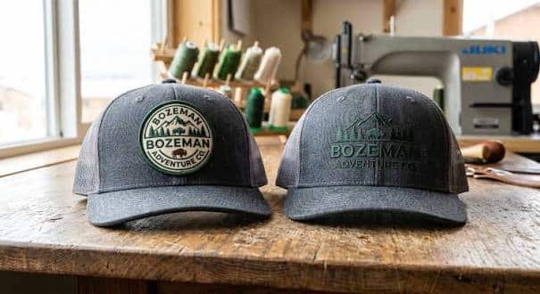
Embroidered hat patches can turn an ordinary cap into branded merchandise, teamwear, workwear, club apparel or a distinctive fashion accessory. However, a design that looks perfect on a computer screen does not always translate perfectly into thread. Embroidery has physical limits, and hats add another challenge because their panels are curved rather than completely flat.
The best embroidered hat patches are designed with those limitations in mind from the beginning. Patch size affects visibility, thread density affects detail, colour contrast affects readability, and placement affects how naturally the finished patch sits on the cap.
Businesses, clothing brands, sports clubs and independent designers can achieve much better results by preparing artwork specifically for embroidery. Working with an experienced supplier of custom embroidered patches can also help turn artwork into a design that remains clear, balanced and practical once stitched.
This guide explains the most important design decisions to consider when creating embroidered patches for hats.
Why Hat Patch Design Requires Careful Planning
A hat provides a relatively small branding area. Unlike the back of a jacket or a large uniform panel, the front of a cap usually has limited space available for artwork.
That means every element has to contribute something useful.
A complicated logo with several lines of tiny text may look impressive at full size but become difficult to recognise when reduced to the dimensions of a hat patch. Similarly, very thin lines can disappear into surrounding stitches, while closely spaced letters may merge together.
The relationship is simple: smaller patch dimensions reduce the space available for embroidery detail.
Good patch design therefore begins by deciding what needs to remain recognisable rather than attempting to reproduce every element of the original artwork.
Start With a Simple, Recognisable Design
Embroidery works particularly well with bold graphics.
Logos, initials, mascots, emblems, symbols and short wording generally reproduce well because the embroidery machine can create clearly defined areas of thread. Extremely detailed illustrations, subtle gradients and photographic elements are more difficult to reproduce accurately using traditional embroidery.
If an existing logo contains intricate details, consider creating a simplified patch version.
For example, a company logo may normally include an icon, business name, slogan and several decorative elements. On a hat patch, the icon and business name may be enough. Removing unnecessary details gives the remaining elements more space and makes the patch easier to recognise from a distance.
Simplicity does not make a patch less professional. In many cases, reducing visual clutter creates a stronger design.
Choose the Right Patch Size for the Hat
Patch dimensions should be selected according to both the artwork and the hat style.
Baseball caps, trucker hats, snapbacks, beanies and bucket hats all provide different amounts of usable space. A wide rectangular patch may sit comfortably across the front panel of a trucker cap but look oversized on a smaller baseball cap.
Most hat patches are designed to create a clear visual focal point without dominating the entire front panel.
Before finalising dimensions, consider the relationship between the patch and the cap. The patch should leave enough surrounding fabric visible to make the design feel intentional rather than squeezed into position.
Artwork complexity also influences size. A basic symbol can remain readable at a smaller scale, whereas a logo containing text and several graphic elements usually needs more room.
Patch size determines available stitch area, and available stitch area determines how much detail can be reproduced clearly.
Keep Text Large Enough to Read
Small lettering is one of the most common problems in embroidered patch artwork.
Thread has physical thickness. When lettering becomes too small, the spaces inside characters such as “A”, “B”, “D”, “O” and “R” can begin to close. Narrow gaps between letters can also disappear.
Fonts therefore need to be chosen for stitchability as well as appearance.
Bold sans-serif typefaces usually reproduce more reliably than extremely thin, decorative or handwritten fonts. That does not mean every patch needs a basic font, but complicated letterforms should be tested carefully before production.
Short wording is usually more effective than trying to place a complete sentence on a patch.
Instead of squeezing a slogan, location, date and company name into a small design, establish a clear hierarchy. Make the most important wording prominent and remove information that does not need to appear on the hat.
Your patch should still be understandable when viewed from several feet away.
Use Strong Colour Contrast
Colour determines more than appearance. It determines visibility.
Dark blue thread on black fabric may technically reproduce the artwork correctly, but the design can become difficult to distinguish. White, cream, gold or another lighter thread would normally create stronger separation against a dark background.
The same principle works in reverse. Dark embroidery often stands out more clearly against cream, white or pale-coloured patch fabric.
Contrast is especially important for lettering.
If text is the primary message, it should remain clearly separated from both the patch background and surrounding graphical elements.
Brand colours can still be maintained, but small adjustments in shade may produce a much more readable embroidered result.
Limit the Number of Colours When Possible
Embroidery can reproduce multiple colours, but using more colours does not automatically improve a design.
A limited palette often creates cleaner results.
Two, three or four carefully selected thread colours can produce stronger visual hierarchy than artwork containing numerous similar shades. Colour separation helps individual design elements remain recognisable after stitching.
Reducing unnecessary colours can also give the patch a more consistent branded appearance.
Think in terms of visual roles. One colour can form the background, another can define the main symbol, and another can highlight lettering or smaller details.
The goal is not to use the fewest colours possible. The goal is to ensure every colour serves a purpose.
Design Around Embroidery Rather Than Print
Printed artwork and embroidered artwork behave differently.
Printing places ink onto a surface and can reproduce tiny details, shading and gradients. Embroidery creates an image by placing physical threads next to and over one another.
As a result, the design should account for stitch direction, thread thickness and stitch density.
Broad shapes work particularly well because stitches have enough room to build solid areas of colour. Thin outlines may need to be slightly widened. Tiny gaps may need additional spacing. Extremely sharp details may need to be simplified.
Embroidered patches use thicker thread and produce a more textured finish, while woven construction can accommodate finer detail and smaller lettering.
If preserving extremely intricate artwork is essential, it may be worth reconsidering whether embroidery is the most suitable construction method.
Think About Stitch Coverage
Embroidery coverage refers to how much of the patch surface is covered by thread.
Some designs use a visible fabric background with embroidered elements placed over it. Others use heavy embroidery coverage so that most of the patch face consists of stitching.
Both approaches can look excellent.
A design with lower coverage can feel traditional and lightweight, while dense stitching can produce a richer and more premium appearance.
However, adding stitches simply for the sake of creating more coverage is not necessarily beneficial. Excessive density can make small patches stiff and can reduce definition between closely positioned elements.
The artwork should determine where embroidery is necessary.
Stitch density creates texture, but controlled stitch density preserves clarity.
Select a Shape That Complements the Artwork
Hat patches do not have to be rectangular.
Round, oval, square, shield-shaped and custom-cut patches can all work well depending on the logo.
The strongest shape is usually the one that naturally follows the design.
A circular emblem generally works well on a round patch because the border reinforces the artwork. A long business name may fit more comfortably inside a horizontal rectangle. A mascot or unusual logo may benefit from a custom-cut edge.
Avoid forcing artwork into a shape simply because that shape is popular.
The patch outline should frame the design rather than fight against it.
Choose the Border Carefully
The border defines the edge of an embroidered patch and influences its overall appearance.
A traditional merrowed border creates a thick stitched edge and works particularly well for standard shapes such as circles, squares, rectangles and ovals.
More complicated shapes often require a heat-cut or laser-cut edge because it can follow corners and irregular outlines more precisely.
Border colour also matters.
Matching the border with the background creates a subtle finish, while using a contrasting border makes the shape more noticeable.
For hat patches, the border should generally support the central artwork rather than becoming the strongest visual element.
Consider the Hat Before Choosing the Patch
The finished patch and the hat should be designed as a combination.
A premium embroidered patch placed on an unsuitable cap can still produce a disappointing result.
Consider the cap colour, material, crown structure and available panel space before approving the artwork. Structured caps usually provide a firmer front surface, while softer unstructured caps behave differently when patches are attached.
Hat colour is particularly important.
A black patch on a black cap can create a subtle tonal branding effect. A cream patch on the same cap creates a high-contrast statement. Neither approach is inherently better; the right option depends on the intended style.
The important point is that patch artwork should not be developed independently from the item that will display it.
Choose an Appropriate Backing
Backing affects how the finished patch is attached to the hat.
Sew-on patches provide a traditional and highly secure attachment. Iron-on backing can be convenient when the cap material and construction tolerate heat. Hook-and-loop backing is useful when patches need to be interchangeable, particularly for tactical or outdoor headwear. Adhesive backing can work for temporary applications but is generally less suitable when permanent durability is required.
Your choice should reflect the end use rather than convenience alone.
For example, a fashion brand producing hats for retail normally wants a permanent attachment. A tactical cap designed to display different identifiers may benefit from removable hook-and-loop patches.
The patch backing therefore affects both function and longevity.
Pay Attention to Patch Placement
The front centre is the most obvious placement for embroidered hat patches, but it is not the only option.
Side panels can carry smaller logos, initials or secondary branding. Some styles also use patches toward the rear of the hat.
Wherever the patch is positioned, it should sit naturally within the seams and structure of the cap.
A patch placed too close to a seam may become difficult to attach evenly. An oversized design can extend too far around the curved front panel and begin to lift at the edges.
Placement should therefore be considered before the final dimensions are approved.
Prepare Clean Artwork
High-quality source artwork makes the production process easier.
Vector artwork is particularly useful because it can be resized without losing definition. Common vector formats include AI, EPS, SVG and editable PDF files.
A high-resolution PNG can also be workable when vector files are unavailable.
However, even perfect digital artwork normally needs to be digitised before embroidery. Embroidery digitising converts visual elements into instructions that control stitch type, direction, sequence and density.
Digitising is not simply converting an image into another file format.
Artwork defines the appearance; digitising defines how the embroidery machine constructs that appearance.
Both stages influence the finished patch.
Always Review the Digital Proof
Production should not begin until the patch proof has been checked carefully.
Look at the overall shape first. Then examine spelling, text alignment, colours, border style and dimensions.
Pay particular attention to anything that has been simplified from the original artwork.
A good proof provides an opportunity to correct problems before physical patches are produced. If wording appears too small or the logo feels crowded, this is the time to adjust it.
Do not approve a proof simply because it resembles the original logo. Ask whether it will still work when converted into thread and placed on a hat.
Common Hat Patch Design Mistakes
Most disappointing results can be traced back to design decisions made before embroidery begins.
The most frequent problems include:
- using lettering that is too small or thin;
- placing too many elements inside a small patch;
- using colours with insufficient contrast;
- choosing a patch that is too large for the cap panel;
- adding extremely thin lines or tiny gaps;
- ignoring the curvature and seams of the hat;
- using artwork designed for print without adapting it for embroidery;
- selecting a backing without considering the hat material; and
- approving a proof without checking the final dimensions.
Correcting these issues during the artwork stage is significantly easier than dealing with them after production.
Should a Hat Patch Use 2D or 3D Embroidery?
Traditional flat embroidery suits most patch designs because it provides clean details and a familiar stitched texture.
Three-dimensional or raised embroidery creates greater depth. It can work particularly well for bold lettering, initials and simple symbols where selected areas need additional emphasis.
However, 3D embroidery should be used selectively.
Small lettering, intricate linework and highly detailed graphics generally benefit from flatter construction because raised stitching occupies more physical space.
A combination of flat and raised embroidery can also create visual hierarchy. Important elements can be elevated while supporting details remain flat.
Again, the design should determine the technique rather than adding 3D stitching simply because it is available.
Creating a Hat Patch That Looks Professional
A professional embroidered hat patch is rarely the result of adding more detail. Usually, it comes from controlling detail.
Strong artwork establishes a clear focal point. Appropriate dimensions give each element enough space. Colour contrast improves visibility. Good digitising translates the design into clean stitches. Correct placement then ensures the patch sits properly on the hat.
Every decision supports the next.
The patch shape affects the border. The border affects usable artwork space. Artwork size affects lettering. Lettering affects readability. Thread colours affect contrast. Hat colour affects the final visual impact.
Thinking about these relationships produces a much stronger result than treating each decision separately.
Final Thoughts
Embroidered hat patches combine branding, texture and durability in a format that works across merchandise, uniforms, fashion, sportswear and promotional apparel.
The key to achieving a clean result is designing for embroidery from the beginning.
Keep important elements bold, give lettering enough space, choose contrasting thread colours, match the patch size to the hat and avoid unnecessary detail. Consider the border, backing and final placement before production starts, and always review the proof at actual size.
A well-designed patch does not need to be complicated to stand out.
When artwork, embroidery and hat placement work together, even a relatively simple design can create a distinctive piece of headwear that people recognise immediately.